
A Deep Dive into Card Design - CardsFTW #142
Plus, Enhanced Transaction Data
Spade + Stripe = Strade?
Spade, a provider of transaction enrichment services, announced its partnership with Stripe's card issuing platform today. The core transaction data you receive from the network when you issue a card can be underwhelming. You don't want to see this if you are a user:
AMAZON RETA* 8X97K1PH3 WWW.AMAZON.COUS
You want to see this:
Amazon.com Retail www.amazon.com
You might also want to see a nice Amazon logo there.
Spade helps you do that. Today, most issuing platforms don't help you here. While you can integrate with Spade directly, this new announcement enables customers on Stripe's issuing platform to do this natively (look, docs!). Spade data can be used not only to enhance the user experience but provide better intelligence around fraud and reduce disputes. We're excited to see what's next here.
The Art and Science of Credit Card Design
This week, we’re diving deep into credit card design, something I’ve spent nearly 20 years working on and thinking about. Card design is more than just aesthetics; it influences how consumers feel about their cards and, by extension, how they engage with a financial product. I’ve seen innovations in the way cards are designed and the impact that design can have on consumers.
If you’ve followed my writing or interviews, you’ve probably heard me mention the “date test,” a concept we used at Green Dot. The idea was simple: Would a cardholder feel confident enough to pull out their card on a date? At the time, our customers were primarily lower-income or credit-limited users with prepaid reloadable debit cards. We wanted them to feel proud of their card, not embarrassed by it.
Cards Are More Complex Than They Look
Designing a payment card is about more than aesthetics. There are technical, branding, and user considerations that shape how a card functions and how people interact with it. Here’s what goes into designing one:
Building Blocks
The modern payment card is a technological marvel. A single card typically includes:
- An EMV chip for dipping
- An RFID/NFC chip for contactless payments
- Various security features like holograms
- A magstripe
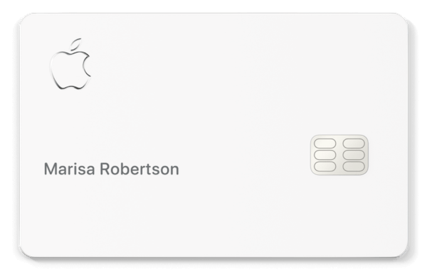
Some issuers experiment with removing elements. Apple’s titanium card, for example, lacks a printed number and supposedly costs nearly $50 per unit. Once again, Apple gets away with things no one else can.
What You Need to Decide
When choosing a card design, you’ll likely need to make several decisions:
- Imagery – What logo, background, or other visuals should appear?
- Finish – Glossy, matte, or coarse matte?
- Core color – The base color of the plastic or metal the card is printed on.
- Magstripe color – If your card includes one, what should it look like?
- Embossing – Should the card details be raised (embossed) or flat?
- Card number placement – Should the number be printed on the front, back, or omitted entirely?
Even small choices, like where the card number goes, can make a big difference in how a customer interacts with it daily.
The Problem with Bank Logos
A lot of card designs still follow an old-school banking approach: make the logo as big as possible. You see this a lot with Bank of America cards, where the logo practically takes over the entire surface. From a marketing perspective, I get it. Banks want brand visibility and a card sitting in a customer’s wallet is a constant reminder of their relationship. But from a design standpoint, it doesn’t exactly inspire pride for most people.

Banks prioritize cost management, which makes sense when you’re issuing millions of cards. Every penny saved in production scales up to big numbers. But in de novo card programs, where we spend a lot of time at Totavi, brands are more focused on making an impression. That’s why the rise of metal cards has been so significant.
The Metal Card Boom
Metal cards have been around for a while: Amex pioneered them with their Platinum and Gold cards. Metal cards really took off in 2017 with the launch of Chase Sapphire Reserve. Suddenly, card weight and material became status symbols. Now, programs are competing on how heavy their cards feel or what sound they make when you drop them.
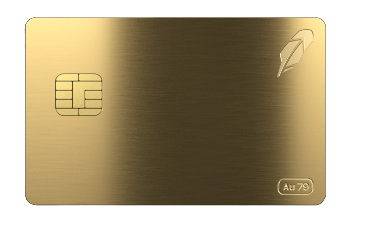
The latest high-profile entry into the metal space is Robinhood’s Gold Card. If you refer at least 10 people, you get a card actually plated in gold. (I haven’t hit the referral threshold yet. Feel free to help me out.) It’s a wild concept, especially since the first attempt at a gold-plated card years ago had a fatal flaw: the gold layer shorted out chip readers.
Beyond materials, we’ve seen interesting design innovations, including some experimenting with foils and other interesting inks. Previously, Nordstrom had a gorgeous rainbow foil credit card that was always the example card.
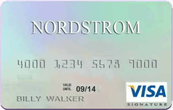
That's no longer true now that TD Bank issues it; now, it's a relatively boring gray card. Maybe they felt the rainbow foil was overused at some point.
Then there are things one can do with the EMV chip itself. Square and Apple customize the etching on their chips.
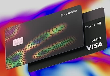
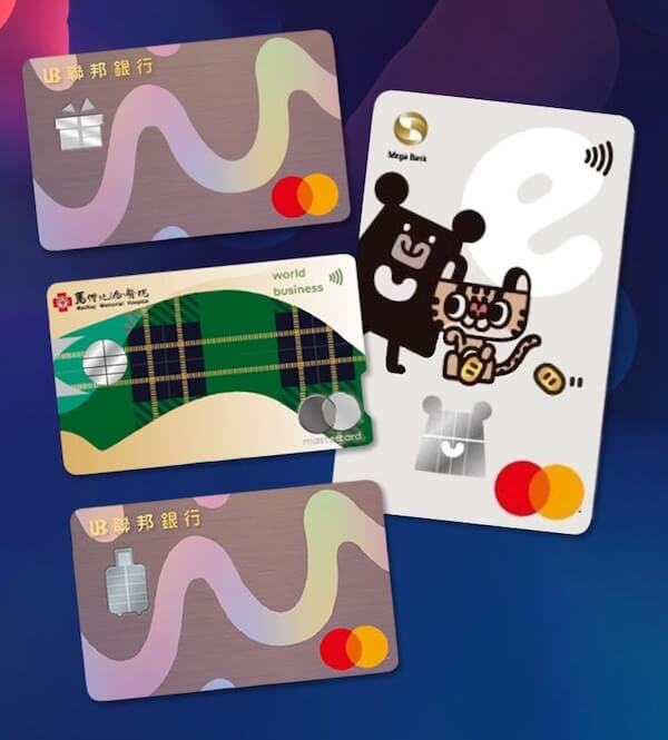
Novoflex’s sAiL product allows custom-shaped chips—think soccer balls or flowers. In Taiwan, banks have already issued cards featuring these designs. (See also CardsFTW #119: A Modest Proposal for Fintech Account Insurance.)
Standing Out in a Wallet
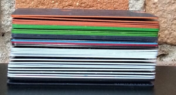
Another design consideration is how a card appears when partially covered in a wallet. Some issuers use colored cores or edges to make their cards recognizable from the side. Chase, for example, frequently uses bright green. These small details help users quickly identify their cards at a glance.
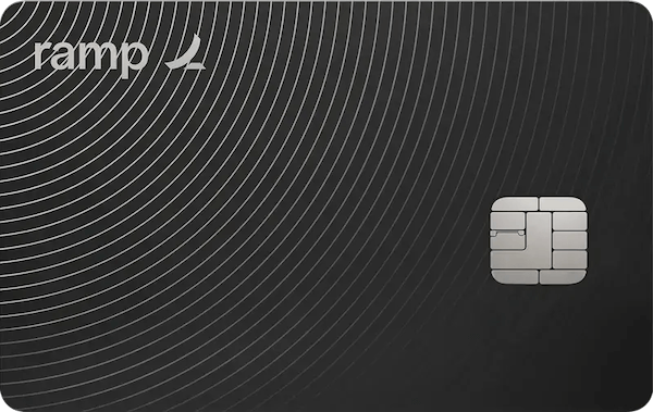
One of the more frustrating trends in card design is printing information upside down relative to how a card sits in a wallet. The Ramp metal card is a prime example—it looks cool, but when you pull it out, you have to flip it before inserting it into a reader. Apple does something similar. While visually striking, it’s not the most user-friendly design choice.
There’s a fascinating contrast between physical card design and how cards appear in digital wallets. Apple and Google have strict guidelines: Even if your card is vertical in real life, it must be horizontal in a digital wallet. These standards ensure consistency, but they also mean that a digital-first world doesn’t always reflect the physical product.
The Cost of Premium Cards
Card production costs vary dramatically:
- Standard plastic cards: ~$2 each at scale
- Apple Card: ~$50 per unit
- Robinhood Gold Card: Likely even more expensive
- Packaging: Premium boxes from Apple or Amex add another $5–7 per unit
Beyond materials, special packaging (like BurgoPak’s sliding boxes) adds handling costs. Metal cards often require manual fulfillment instead of automated machines, increasing labor and postage costs. For many issuers, the unboxing experience is a key part of their brand strategy, allowing for social media videos and some card-nerd FOMO. A viral video can be priceless for marketing.
Visual Signals
Metals and higher-end designs speak to the pride factor. We converted our Green Dot card from this silver design:

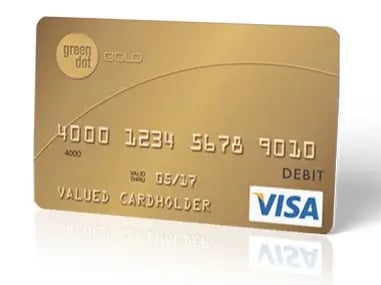
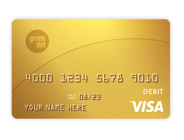
to a gold card in 2006 or 2007:

The new card was shiny, although not metal. The Mastercard was actually not gold, but bronze, because Mastercard told us we couldn't have a "gold" debit card.
Visa said we could. We also wrote "gold" on it, because research showed consumers preferred that. (In fact, a blue card that said "gold" tested above a plain gold card, but nothing topped the gold card that said "gold.")
Final Thoughts
Credit card design is a mix of branding, user experience, and manufacturing constraints. While metal cards dominate the conversation, there are plenty of other ways to create a distinctive, high-quality card. Whether through materials, colors, chip customizations, or packaging, the physical card remains a powerful brand touchpoint, even in an increasingly digital payments world.
There’s so much more to explore in this space, and this is just the beginning of a deeper look into card design. Let me know what aspects you’d like to dive into next.
Me, Elsewhere
I make an appearance in CardRates talking about JetBlue’s new card (see CardsFTW #141). It was starting to get deep!
“Humans are status-driven animals, and a lot of people sign up for rewards cards because they sound amazing, not necessarily because they’re practical,” Goldman told us. “People who use their Chase Sapphire when out to dinner with friends are using it for more than just making a payment. They’re saying that they have good credit, and they value travel and experiences.”
CardsFTW
CardsFTW, released weekly on Wednesdays, offers insights and analysis on new credit and debit card industry products for consumers and providers. CardsFTW is authored and published by Matthew Goldman and the team at Totavi, a boutique consulting firm specializing in fintech product management & marketing. We bring real operational experience that varies from the earliest days of a startup to high-growth phases and public company leadership. Visit www.totavi.com to learn more.
Interested in reaching our audience? You can sponsor CardsFTW.